Thursday, April 30, 2009
Hungry babies

Friday, April 24, 2009
$1.95
A new window on the world
The plan is to build a window seat across the bottom width of the window with drawers in it for storage and there will be built-in bookshelves on either side.
And if you're wondering what the "polka dots" are, they're remnants of the glue that held on the wainscoting. Lots more work to be done!
Tuesday, April 21, 2009
Bathroom update
Click to view larger...

The tile for both the floor and the shower floor is blue-gray with hints of brown. It's a porcelain tile from Italy (TC Textile) and it has texture to it, kind of like grass cloth. We'll be using large 13"x26" tile on the floor and small squares on the shower floor. We got the idea from the tile store. Here's a photo from their showroom mock-up:

The wall tile is an 8"x13" porcelain tile (Line Blanco) from Spain that is white with faint vertical brown streaks. The mosaic tile is from Mandala tile, Wavelength blend in the Rimini color, but the picture on their website doesn't really look like it does in real life. It goes really well with the two other tiles.
So it will be a modern bathroom, but not too far out. I know the last concept pictures I showed were of a more neutral bathroom with stone tiles but we decided to go with my original desire to incorporate glass mosaic tile. I think it will look great.
The skylight is in and it's fabulous to have afternoon sun in that part of the house. I want to put skylights all over the house now! All the electrical and plumbing is finished and the contractor planned to finish the shower and tape the drywall today. The bay window for the bedroom arrives on Wednesday so he'll shift gears to install that and finish the siding. The front door should arrive next week. I'll be getting my sketchpad out again to draw up my ideas for the bathroom vanity and the bookshelves/window seat that the contractor will be building for us. I kinda like being a designer.
Friday, April 03, 2009
What started out as a "simple" project to re-side the house...
I'm also happy that we're not doing the work. This time. We've done a lot of the work on our house ourselves and while I enjoy the accomplishment of DIY, it's a lot of work. I love the design process and I like understanding how everything fits together (like electrical and plumbing), but it is stressful because much of DIY is learned on the job, and I don't mean my 9-5 job. For that I first got an education and then had managers and peers to guide me. But even though someone else is doing the labor, I'm still providing the design input and I do enjoy that. I'll share with you what we're doing with the bathroom and I welcome any comments too!
Here is the bathroom layout, which I drew up in Visio because I love playing architect. (click to biggify)

We're not changing the layout except to expand the vanity, which was a 36" cabinet flanked by cat boxes on either side. We're incorporating space for one cat box in the new, custom-built cabinet. The new cabinet will have shelves built into one side but we'll temporarily remove the shelves and put the cat box in there. When it comes time to sell the house, out comes the cat box and in go the shelves to show off fluffy towels and a basket for storage. The other side of the cabinet will be drawers and the middle, where the sink is, will be doors. I know you might be wondering why we're not putting in double sinks. I think double sinks would take up too much cabinet storage and counter space and besides, the bathroom isn't really big enough for two people to use at the same time. Plus, the other bathroom is right next to the master bath.
The new vanity area will look a bit like the picture (shamelessly copied from the internet) below, but I don't think we'll have such a large mirror, there will be a light above the mirror as well as on either side, and the cabinet won't have doors on either end. But otherwise it is a good representation of the overall look.

Another major change is the shower. You can't tell from the drawing, but the wall between the shower and the toilet used to go to the ceiling and now it will be a half wall with glass above it. The old shower had sliding glass shower doors in the front which resulted in a too-small opening and also were hard to clean because they overlapped. The new shower door will look something like this:
The bathroom was always pretty dark, partly because of the big dividing wall and also because it only has a small window that looks out onto the narrow side yard and the house next door. We are installing a vented skylight in the ceiling and that should bring in lots more light. I was concerned about privacy because the house next door is two story while ours is a ranch, but it looks like the geometry of the skylight opening prevents a clear line of sight. Also, the skylight is only 22x22 inches.
We're also changing the door from one that swung into the bathroom (and got in the way) to a pocket door. Unfortunately the pocket door can't go on the other wall because the plumbing is being relocated to that wall. The wall to the right of the vanity will have to be built out some to accommodate the wall switch but it may not protrude too much. Also, we could install a medicine cabinet in that wall if we make the wall deep enough. Haven't decided about that yet. Yes, I considered moving the switches to the other wall and in fact that was the instruction I gave the contractor this morning, but I changed my mind by lunchtime. Putting them on that wall will reduce the size of the shower by a few inches and I just don't want to do that. Also, the pocket door will probably remain open most of the time so access to the switches when you enter the room shouldn't be a problem.
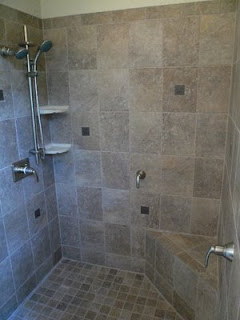
We haven't decided on the tile but here are some ideas. I like the look of the larger tile on the walls and the small tile on the shower floor, but not necessarily set on the diagonal. Hadn't thought about tiling the ceiling. We will also have a recessed light in the shower.
I like these rectangular tiles, with the edging on the top, but I don't care for the medallions. And what on earth are all the handles for? Maybe those aren't medallions but jet sprays? We're just going for a nice, but basic shower fixture - no rain heads or jet sprays.

Do you spot a theme here? I like the neutral palette and look of natural stone. This border's a bit too fussy for me, but it's another example of big tiles on the wall and small tiles on the shower floor.
I like this decorative border because it's simple. This picture was of the tiling in progress. The large blocks continued above the border but pictures of the final tile didn't show the detail of the border very well.
Our contractor said he can put in a shelf. I think this is what he described to me. I don't like the size of the tiles in the inside but I do like the two areas and the size of the mitered border is pretty good.
I like the look of the tiny tile in the inset but I'm not crazy about the thick mitered border and the thick shelf.

One more feature to the bathroom is a cabinet above the toilet. We had one previously and had no problem filling it up. Since I'd like to have a decorative mirror above the vanity we will lose the medicine cabinet we once had (and filled to capacity). But I think I've come up with an interesting alternative. Mount spice-rack type shelves on the inside of the doors to the cabinet above the toilet. I like the design below because the Plexiglas lets you still see what's on the shelves. Our contractor is going to build the cabinet so he should have no problem replicating this design.
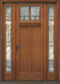
So this is why I haven't been sewing. I've been busy playing interior designer. And exterior designer as well. This all started as a siding project, along with new doors. The doors won't be in for a few more weeks but here's what they will look like:

Can you see me smiling? I'm so happy and excited that these projects are getting done. The house already looks a thousand percent better even with only part of the siding up and painted. The bathroom is not the end of the projects (hopefully). The bedroom is next. We have talked with our contractor about putting in a tray ceiling (to make the room feel larger), recessed lighting, refinishing the floors, redoing the walls, and installing closet organizers. I dread packing everything up and moving it to wherever we can find space in the rest of the house, and we'll have to sleep in the guest room, which is currently occupied by too much of my sewing stuff, but I think the reward will be worth it. The rooms will be fabulous. And then I can get back to sewing.


